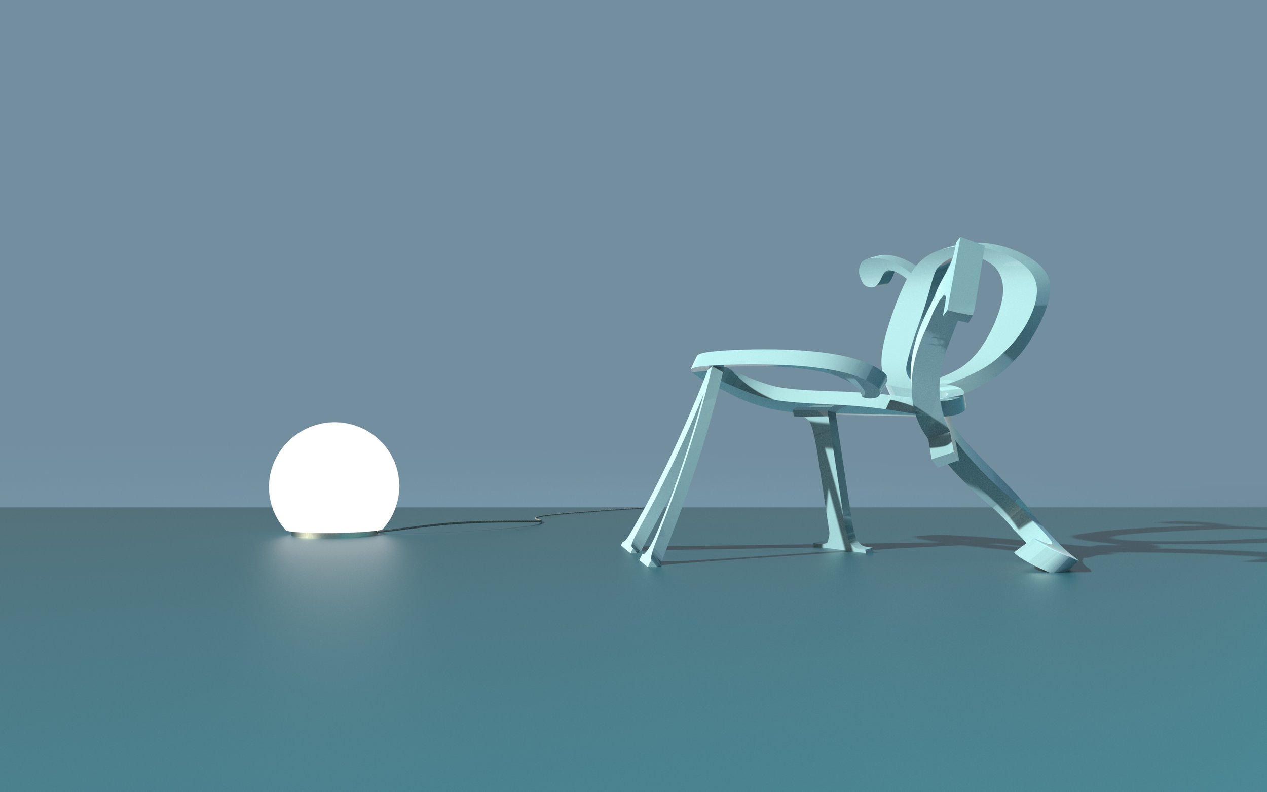
King’s Roman Chair
2019
Redefine tradition.
The King’s Roman typeface (le Romain du Roi) was a turning point in typography, developed by Philippe Grandjean in 1692. For the first time, a rational grid system was used to design letters, marking the start of standardization in typography. The story is often told that this shift toward reason came at the cost of creativity—sacrificing the artistry of individual punchcutters for the sake of reproducibility. Today, some say the same about scripted design in architecture: "Who is the designer if a computer made the design?" Winston Alford-Hamburg argues that authorship doesn’t vanish with structure—it simply evolves.
Images’ source: Académie Royale des Médailles et des Inscriptions - Académie Royale des Médailles et des Inscriptions, Medailles sur les principaux evenements du regne de Louis le Grand, avec des explications historiques, Paris : Imprimerie royale, 1702

Squiggle me.
Find authorship in the grid.
While Grandjean’s grid restricted each letter's design, it also expanded the alphabet, establishing a rhythm that transformed typography from a collection of individual letters into a cohesive song. Inspired by this evolution, Winston recreated Grandjean’s gridded letters and applied new transformations to them. Where Grandjean simply slanted the grid to form italics, Winston bent his grid, translating these two-dimensional drawings into three-dimensional forms. With each step, decisions had to be made: how far to bend the letter, where to start the arc, and whether to bend it forward or backward. In making these choices, Winston found his voice within Grandjean’s system, authoring new forms from historical constraints.
Bentwood is typography for your butt.
The resulting shapes from these bent letters reminded Winston of early Thonet bentwood experiments. Thonet developed a technique for steaming wood, making it pliable to create dynamic, curving forms. Winston imagined his letters as the bentwood equivalents of Grandjean’s rigid designs. This concept led to the creation of the King’s Roman Chair—a chair shaped by the transformation of these letterforms. An F forms a leg and armrest, a V shapes the front legs, an I becomes the second back leg, and a G curves into the seat and back.
Barros, Mário, et al. "Thonet Chair Design Grammar: A Step Towards the Mass Customization of Furniture." ResearchGate, 14th CAAD Futures Conference, University of Liège, July 2011, www.researchgate.net/publication/268981591_Thonet_chair_design_grammar_a_step_towards_the_mass_customization_of_furniture.


